Overview
Designing a shared scheduling app for families managing busy routines.
HuddleUp is a mobile app concept designed to help families coordinate schedules, tasks, and shared responsibilities in one place. The idea came from a common problem: family planning often happens across group texts, separate calendars, reminders, and memory.
The product explores how a shared scheduling tool could make everyday coordination feel easier. Users can create family groups, add events, assign tasks, invite members, and manage household details from one central place.
I tested both low-fidelity and high-fidelity versions of the app to understand how users moved through the core flows and where they needed more guidance.
Problem
Family coordination gets harder when information lives in too many places.
Busy households often manage school events, appointments, errands, chores, reminders, and last-minute changes all at once. When those details are split between group texts, separate calendars, notes apps, and memory, it becomes easier for tasks to get missed.
This can also place more of the mental load on one person, even when the work is meant to be shared.
HuddleUp explores how a scheduling app could make shared planning feel more organized without becoming another tool people have to work hard to maintain. The challenge was to make the experience flexible enough for families, but simple enough to use every day.
My Role
I led the product design process from research through prototype iteration.
I designed HuddleUp as an end-to-end UX/UI project, starting with research and early product strategy before moving into wireframes, prototypes, usability testing, and final UI design.
My work focused on the core mobile flows families would rely on most: creating events, assigning tasks, inviting members, and managing shared household details. I used testing feedback to refine the experience, especially around labels, confirmation states, and the steps users needed to complete common actions.
The goal was to design a product that felt organized and helpful without adding more complexity to an already busy routine.
Research
Research helped me understand how families might manage shared planning in one place.
I tested both low-fidelity and high-fidelity versions of HuddleUp to understand whether the core flows made sense to users. The low-fidelity test included five participants completing tasks like scheduling an event, creating a task, inviting a family member, and editing household information.
I also ran a high-fidelity usability study with six anonymous survey respondents. Participants moved through key flows and shared feedback on ease of use, clarity, and whether the app felt useful for family coordination.
The research showed that users understood the overall concept and saw value in having one shared place for family schedules and tasks. It also revealed areas where the experience needed more guidance, especially around labels, confirmation states, and the steps users needed to complete common actions.
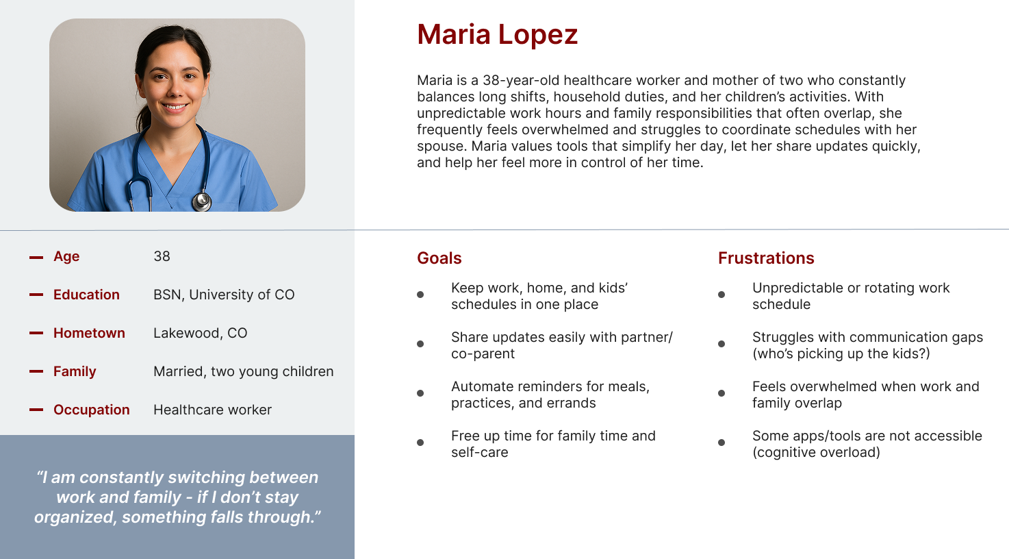
Maria represents a busy caregiver balancing work, family schedules, and household responsibilities. Her needs helped frame the product around shared visibility, easier planning, and reducing the mental load of keeping everyone aligned.
Design Process
I focused the design around the actions families would need most often.
I started by mapping the main actions a family member would need to complete, such as creating an account, joining or creating a family group, adding events, assigning tasks, and managing shared household details.
From there, I sketched early homepage ideas to explore how schedules, tasks, and family visibility could work together in one place. The low-fidelity wireframes helped me test the basic structure before spending too much time on visual design.
As the product moved into higher-fidelity screens, I focused on making the experience feel easy to scan and simple to maintain. The interface used familiar mobile patterns, clear cards, and direct language so users could understand what needed attention without feeling overwhelmed.
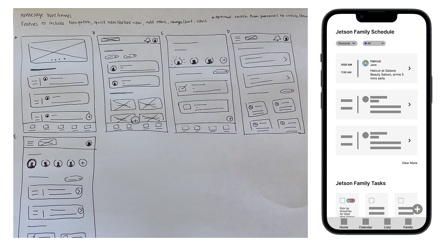
These concepts explored how family events, tasks, and shared household information could be organized from one central starting point.
Final Solution
The final prototype gave families one place to plan, assign, and stay aligned.
The final prototype focused on the core flows families would need to use most often: setting up an account, creating a family group, adding events, assigning tasks, inviting members, and updating shared household details.
The main experience centers around a family dashboard, where users can quickly see what is coming up and what needs attention. From there, users can move into shared calendar views, task lists, family member details, and important household information.
The goal was to keep the app useful without making it feel overloaded. Each screen was designed to be easy to scan, with clear actions and familiar mobile patterns that could support everyday family coordination.
.webp)
Results
Testing validated the concept and helped identify areas for refinement.
Users understood the purpose of HuddleUp and were generally able to complete the main flows. They saw value in a shared place for schedules, tasks, and family information.
Testing also showed where the experience needed more clarity. Some labels could be more direct, confirmation states needed to be stronger, and a few flows could be streamlined to help users move through common tasks with less uncertainty.
The research had a few limitations. The high-fidelity study was anonymous, which made follow-up questions difficult, and the sample size was small. Future testing would need a broader group of users and more realistic family scheduling scenarios.
Reflection
This project helped me think more critically about product clarity and research quality.
HuddleUp helped me move from an early product idea into a tested mobile prototype. It also showed me how much the quality of the research affects the quality of the design decisions.
One of my biggest takeaways was that a useful product does not just need the right features. It also needs clear labels, strong feedback, and flows that help users understand what happened and what to do next.
If I continued this project, I would refine the onboarding flow, expand the family dashboard, add stronger empty states, and test with parents or caregivers managing real household schedules.