Overview
Modernizing a medical education website to better support course discovery.
Maverick Medical Education offers specialized training courses for healthcare professionals, including regional anesthesia, point-of-care ultrasound, chronic pain, and regenerative medicine education. The website needed to support a growing course catalog while helping users quickly understand available programs and take action.
The redesign focused on refreshing the visual identity, improving page structure, and creating a more polished digital experience. The goal was to make the site easier to navigate while strengthening trust with prospective students and healthcare partners.
Problem
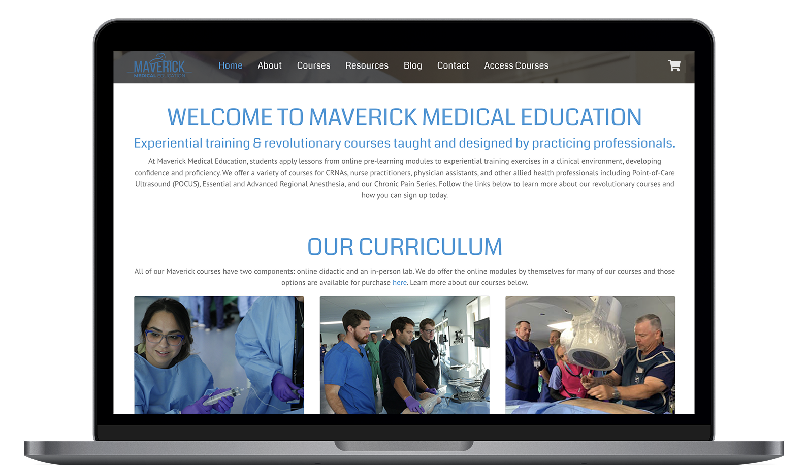
The existing site needed a clearer structure and a stronger brand experience.
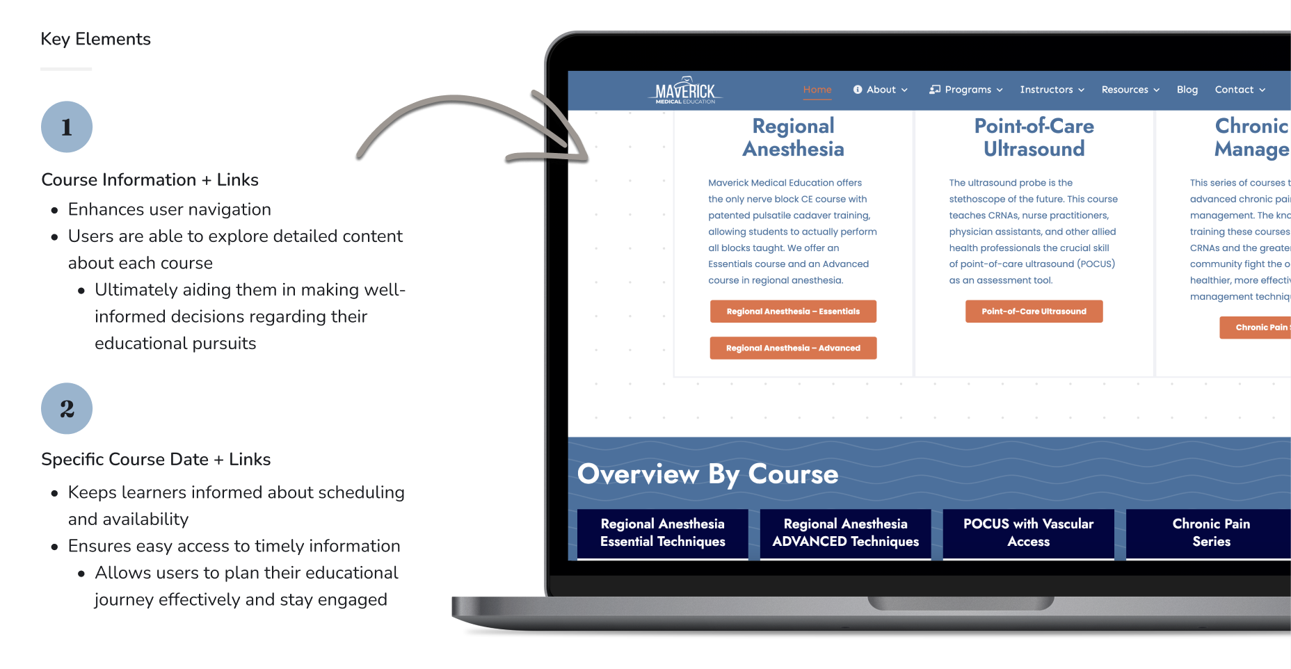
Maverick had a wide range of course offerings, provider types, resources, and continuing education information. As the business grew, the site needed to make that information easier to scan and understand.
Users needed a clearer path to browse courses, compare training options, access online learning, and understand the value of Maverick’s hands-on education model. The redesign also needed to make the brand feel more modern, credible, and aligned with the healthcare education market.
My Role
Website design and development across structure, visuals, and implementation.
I worked on the redesign as part of my web design and development role at Impact Group Marketing. My responsibilities included page layout, visual design support, responsive design, content updates, WordPress implementation, Shopify support, and quality checks before launch.
I also helped make sure the site was easier to maintain after launch. This included creating flexible page sections, supporting eCommerce needs, and refining the overall user experience across desktop and mobile.
Research
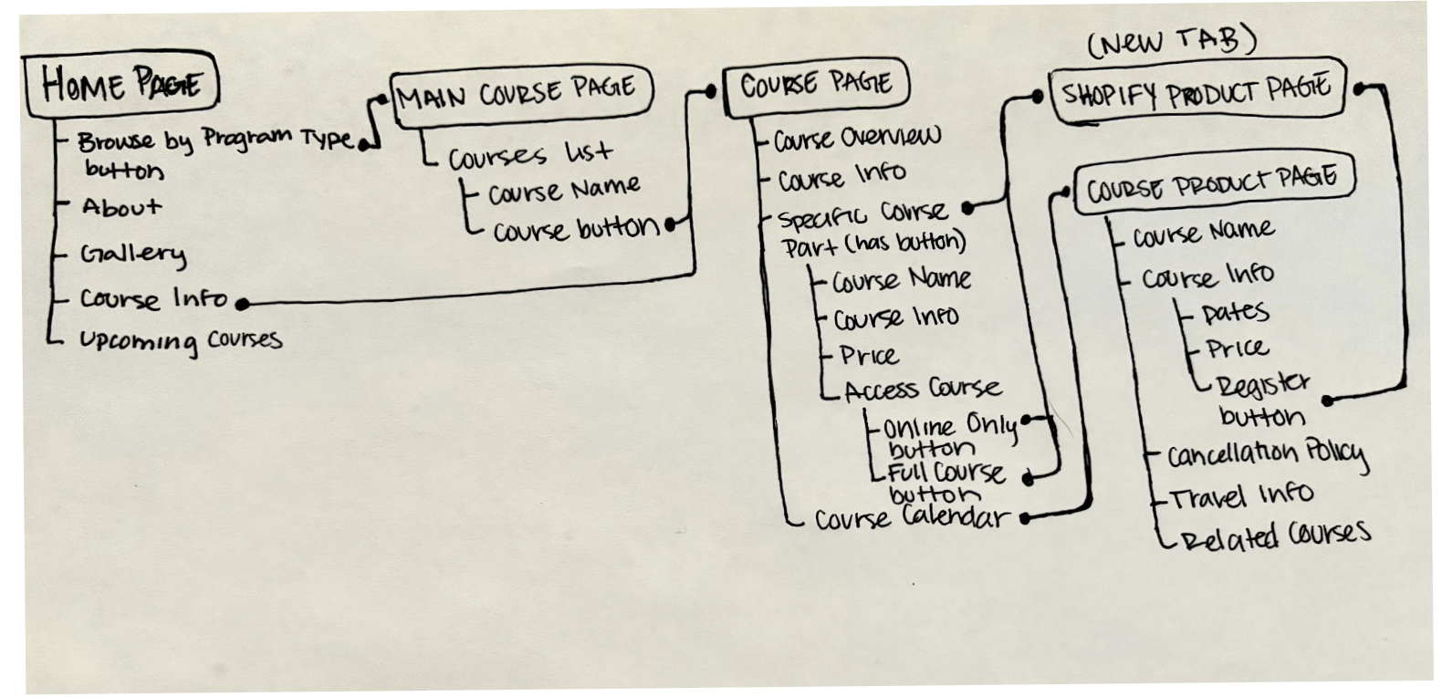
Research focused on understanding the audience and simplifying course discovery.
The project began by reviewing the existing site structure, visual direction, and competitor websites in the healthcare education space. This helped identify opportunities to improve navigation, content hierarchy, and the overall presentation of Maverick’s course offerings.
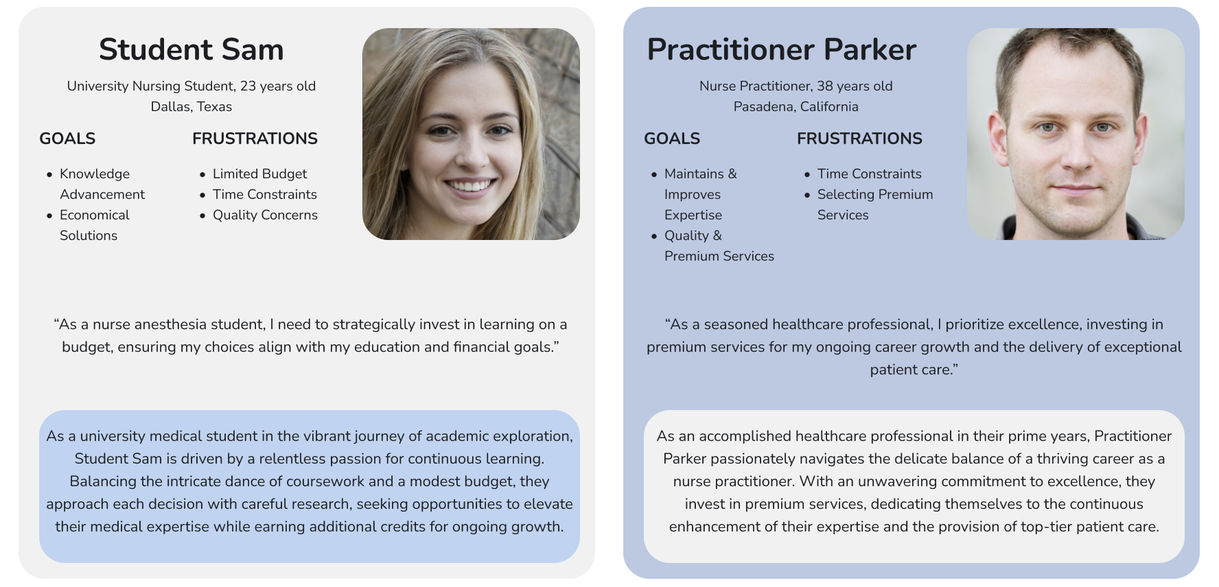
We also considered the needs of different healthcare professionals visiting the site. Users needed to understand which courses were relevant to their role, what format the course was offered in, and how to register or learn more.
Design Process
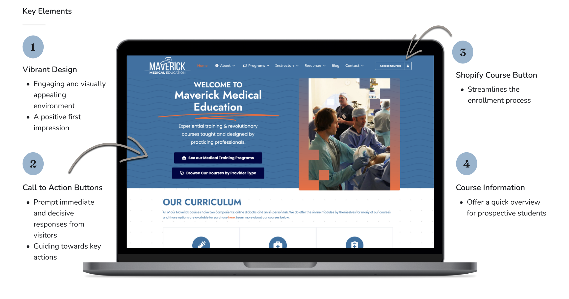
The design focused on brand clarity, course hierarchy, and conversion paths.
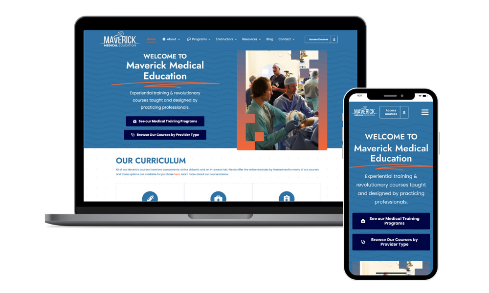
The redesign used a cleaner visual system to make the site feel more current and trustworthy. Page layouts were structured around clear content sections, stronger calls to action, and easier scanning for users researching courses.
We focused on making important actions easier to find, including browsing course options, viewing the full course calendar, accessing online courses, and contacting the Maverick team. The site also needed to support both marketing content and eCommerce functionality.
Final Solution
A refreshed website that makes Maverick’s programs easier to understand and explore.
The final website created a more polished brand experience while improving the structure of key information. Course categories, program pathways, testimonials, and registration actions were presented in a way that better supported prospective students.
The redesigned experience helped users move from learning about Maverick to exploring course options with less friction. The final site also gave the business a stronger foundation for future content, course updates, and marketing needs.
Results
The redesign improved engagement and reduced bounce rate.
After launch, the site showed stronger engagement signals. Users spent more time on the site, viewed more pages per session, and bounced less often. These results suggest that the new structure and visual direction helped users better engage with Maverick’s content.
Reflection
This project showed how much structure matters in a content-heavy website.
Maverick’s site needed to communicate a lot of information without overwhelming users. The biggest challenge was creating a design that felt polished and modern while still making course details, registration paths, and educational content easy to find.
This project helped strengthen my understanding of how brand design, content strategy, and technical implementation work together. A successful website is not just about how it looks. It also needs to guide users clearly and support the business after launch.